
The decoration of a house relies on a set of technical choices that determine the ambiance, functionality, and visual coherence of each room. Successfully decorating your home this year requires understanding a few fundamental principles before taking action, rather than accumulating decorative purchases based on whims.
Proportion and scale: the technical foundation of successful home decoration
Before choosing colors or furniture, the first concept to master is proportion and scale. An oversized sofa in a small living room overwhelms the space. A tiny coffee table in front of a large couch creates an imbalance that the eye perceives immediately, even if it can’t always explain why.
See also : Energy renovation: tips and solutions to sustainably improve your home
The principle is simple: each piece of furniture should be sized according to the volume of the room and the other elements present. For a modest-sized living room, opt for a two-seater sofa paired with an armchair rather than a corner sofa that blocks circulation.
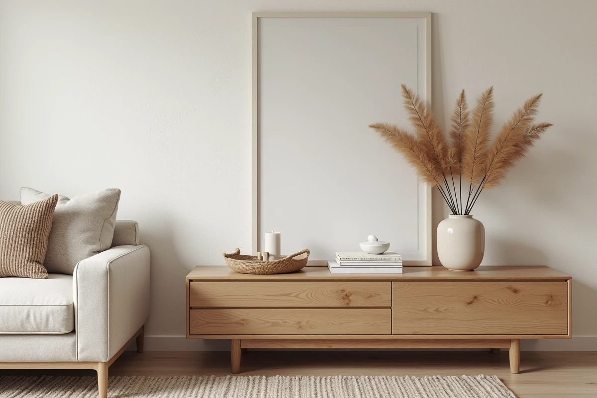
This logic also applies to wall elements. A small frame isolated on a large wall appears to float. Grouping several frames of varying sizes into a cohesive composition yields a more polished result. The height at which you hang artwork also matters: the center of the picture or composition should be at eye level, roughly the same height as your standing conversation partners.
Read also : The best tips for easily succeeding in your real estate project in 2024
Competitions and awards in the industry value this attention to proportions, and platforms like tropheesdelamaison.com highlight achievements where this dimensional balance makes all the difference between a decorated interior and a truly thought-out one.
Color palette for your interior: moving beyond all-white
All-white remains a common reflex, perceived as a safe choice. It works well in very bright spaces, but in a north-facing or poorly lit room, a pure white can appear cold and dull.
Building a palette is based on a principle called the rule of three tones: a dominant color (walls, floor), a secondary color (main furniture, curtains), and an accent color (cushions, decorative objects, lighting). This distribution helps to visually structure the space without overwhelming it.
Choosing the right paint finish
Choosing the color is not enough. The finish of the paint radically changes the appearance. A matte paint absorbs light and hides the imperfections of an old wall. A satin finish reflects more light and is better suited for humid rooms like the kitchen or bathroom, as it is easier to clean.
Terracotta, sage green, and muted blue are among the tones that are becoming staples in contemporary interiors. They pair well with natural materials like light wood, linen, or raw ceramics.
Decorative lighting: layering light sources
A single central ceiling light is the most common configuration, and also the least flattering. It produces flat lighting that flattens volumes and removes contrasts. The decoration of your home gains depth as soon as multiple types of light sources are layered.
- General lighting (ceiling light or pendant) provides the basic brightness of the room but should remain moderate in intensity to avoid flattening the space.
- Task lighting (desk lamp, reading lamp, kitchen spots) targets a specific area where direct light is necessary for an activity.
- Ambient lighting (string lights, table lamps, candles) creates zones of visual warmth and adds dimension to every corner of the room.
The ideal is to have at least three light points per main room, independently adjustable. A dimmer on the central pendant allows for a transition from work lighting to a more subdued ambiance in the evening.
The color temperature of light bulbs
A often-overlooked detail: color temperature, measured in kelvins. Bulbs around 2700 K produce a warm light, suitable for living spaces. Above 4000 K, the light leans towards cold white, more suitable for a garage or workshop than a living room.
Mixing bulbs of different temperatures in the same room creates an unpleasant visual inconsistency. Check the packaging before purchase to ensure harmony.
Materials and textures: what distinguishes a flat interior from a lively one
Layering textures adds a tactile dimension that colors alone cannot provide. A corduroy sofa paired with a linen throw and boucle wool cushions creates a play of materials that is perceptible even in photos.
The principle also applies to floors. A jute rug on oak flooring provides a contrast of fibers that visually delineates a space without closing off the room. This technique is particularly effective in open spaces like living-kitchen areas, where it is necessary to mark zones without erecting partitions.
- Combine matte materials (linen, terracotta, raw wood) with shiny materials (brass, glass, glazed ceramics) to create contrast.
- Limit the number of different materials to four or five per room to avoid visual cacophony.
- Favor materials with traceable origins, especially for wood and stone, to ensure a consistent approach with current environmental standards.
Incorporating elements made from natural materials, such as artisanal ceramics or rattan, adds a surface irregularity that makes the space feel more organic. This slight visible imperfection in the material is precisely what gives an interior its character, as opposed to perfectly smooth industrial finishes.
A home decoration that lasts over time relies less on seasonal trends and more on these technical fundamentals. Correct proportions, a mastered palette, layered lighting, and varied materials form the foundation from which each personal style can express itself without risk of misstep.